Executive Summary
Most anime-merch storefronts default to generic templated themes — grid of products, add-to-cart, done — which undersells the culture around limited "drop" releases that streetwear and anime-collab brands actually thrive on (think collector hype, scarcity, and lore).
I saw an anime-themed e-commerce concept and used it as the starting point for a full front-end redesign: ZENJI, a fictional limited-edition anime streetwear label. The goal was to design and build a storefront that feels like a capsule drop event rather than a generic catalog page — while still handling the real mechanics of an e-commerce site: browsing, filtering, quick view, cart, and wishlist.
1. Reframing the Product Page as a "Drop"
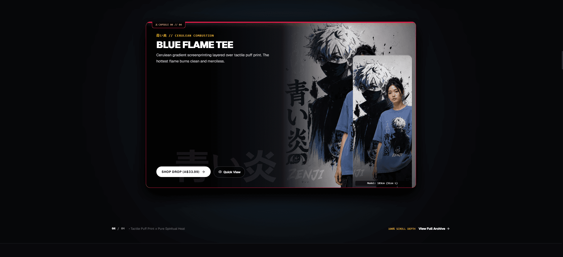
Instead of a standard product listing, the homepage centers on the current capsule drop (e.g. "Capsule 04 // Blue Flame Tee") as a hero moment:
- Cinematic hero layout: Large character-driven artwork paired with bold, oversized typography and bilingual (Japanese/English) labeling to sell the anime-lore aesthetic.
- Scarcity cues: "No restocks ever" framing, serialized capsule numbering, and a live countdown to the next drop — borrowed from streetwear drop culture rather than typical e-commerce patterns.
- Quick View + Quick Add: A modal lets shoppers preview sizing and fabric details without leaving the hero, reducing friction between hype and checkout.
- Confetti payoff: A
canvas-confettiburst fires on add-to-cart/checkout moments — a small celebratory beat that reinforces the "you just secured a limited drop" feeling.
2. Visual & Interaction Design
- Dark, high-contrast theme: Near-black backgrounds (
#0e0e12) with accent lighting (cerulean blues, amber highlights) to make product photography pop and reinforce the "premium drop" feel over a discount-bin aesthetic. - Typography as brand voice: Oversized display headings mixed with kanji typography and monospace micro-labels ("CAPSULE 04 // 04") for a technical, catalog-card feel.
- Consistent component system: Collection grid, lookbook, and sale/archive pages all reuse the same card, badge, and button primitives so the site reads as one designed system rather than disconnected pages.
3. Site Structure
Beyond the drop hero, the redesign covers the full storefront surface area expected of a real store:
- Collection — filterable/sortable catalog (price, rating, product type).
- Lookbook — editorial photography with hover-driven exploration.
- Our Story — brand lore and positioning copy.
- Sale — discounted archive pieces from past capsules.
- Wishlist & Account — saved items and login/signup flows.
4. Technical Implementation
- Next.js 16 + TypeScript: The app is built on Next's App Router with
next/imagehandling responsive, AVIF/WebP-optimized product and lookbook imagery, and TypeScript for type safety across components. - Tailwind CSS 4: Utility-first styling via
@tailwindcss/postcsskept the dark theme, spacing, and responsive breakpoints consistent across the countdown, modals, and grid layouts without a heavy custom CSS layer. - Lucide icon set: Used throughout the nav, filters, and cart/wishlist affordances for a consistent, lightweight icon language.
- canvas-confetti: A lightweight confetti effect layered on top of key interaction moments (add-to-cart, checkout) for a bit of drop-culture theater.
- Deployed on Vercel: Straightforward CI-less deployment straight from the Next.js app, with edge-optimized images for the hero and gallery sections.
Key Takeaways
- Design systems thinking: Translated a single visual idea (anime streetwear drop) into a reusable component system across five+ distinct page types.
- E-commerce UX beyond the template: Rebuilt the standard "browse → cart → checkout" flow around scarcity and drop mechanics without sacrificing usability.
- Performance-conscious front-end: Leaned on Next.js image optimization to keep a visually dense, artwork-heavy site fast and responsive.